Acting as UX/UI Designer, I was solely responsible for all aspects of UX and UI of the property search sales funnel , including research, design, testing and QA.
This programme of work took over 2 years to complete.
PROJECT DRIVERS
A number of factors brought about this programme of work:
- Organisation-wide desire to use Salesforce to create and manage leads – and all other customer interactions
- Help more customers find the right homes for them and get on the property ladder
- Measure and improve lead generation performance
- Desire by the Marketing Dep’t to content manage properties quickly and easily
- Become digital industry-leaders in the shared ownership sector
RESEARCH
Over this programme of work, extensive research was carried out, at time-appropriate points.
At the outset, we interviewed people who were looking to buy a shared-ownership home to understand their thought processes and how they approached their search. What were the key factors involved? How did they approach their search? Because shared ownership is fairly niche and not widely available, it was not reasonable to assume that the ‘usual’ approach to searching for a new home would apply, and this was borne out to be true. We also interviewed people who had never heard of shared ownership before, to see if they understood the content around the basic concepts. It was extremely enlightening! People had very diverse views on what shared ownership meant, and the old adage applies that people just don’t read content!
As individual tools were developed, specific tests were carried out in order to test assumptions.
All deliverables were usability tested with customers to make sure they were understood and could be used with no issues.
KEY DELIVERABLES
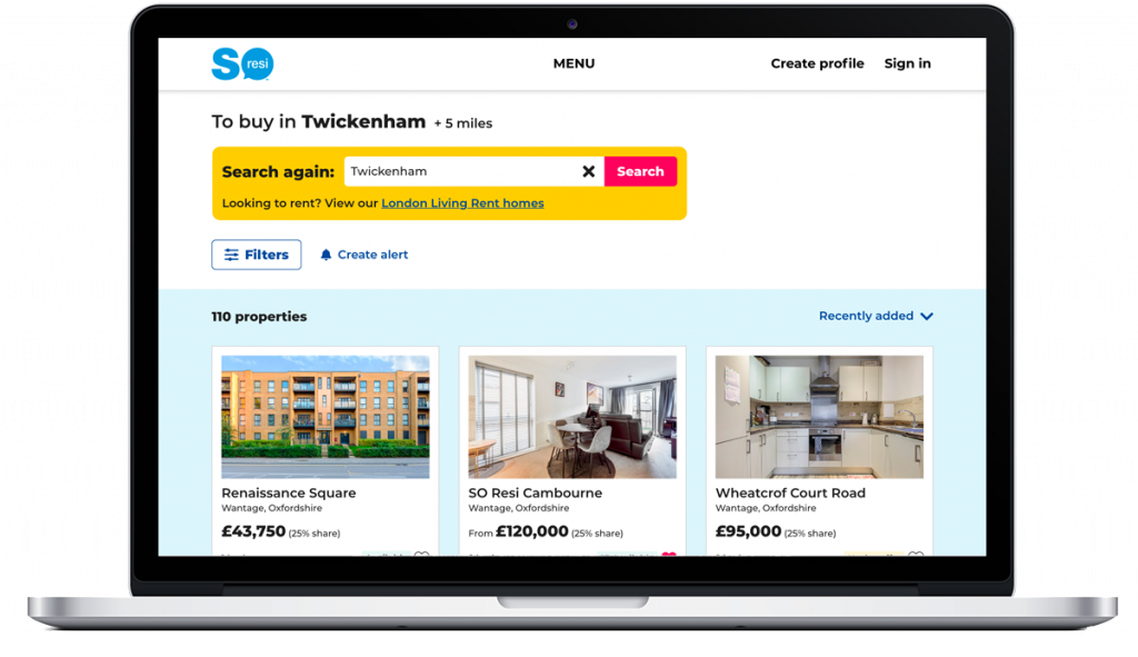
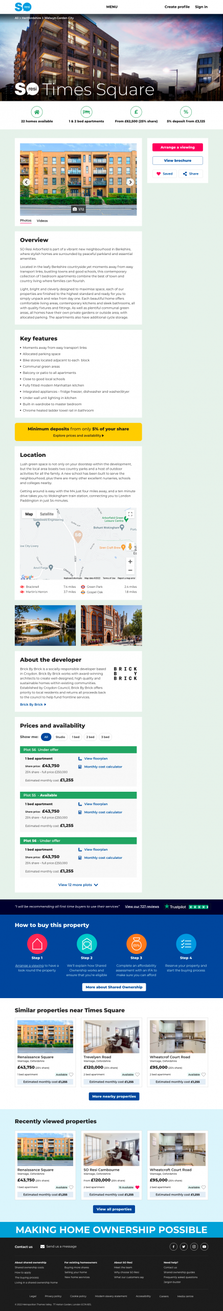
Search page
I redesigned the search page with improved overall design, filters and sorting. The property card design was improved, highlighting the information we know customers prioritise.
Alerts and Saved Searches tools were added to help customers who couldn’t immediately find what they were looking for.
Private sales and rental properties were added later, broadening the offering.
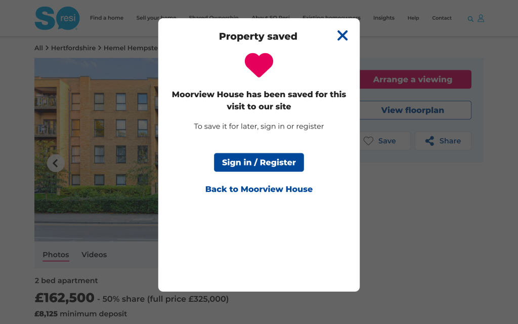
Favourites
I created a favourites system that allowed users to save favourite properties for that visit to the site without the need to register or login, part of our philosophy to minimise friction and maximise customer value.
Property pages
I designed a new set of modular page templates for properties. Properties fall into 2 categories – brand new developments and pre-owned – and so there was the challenge to make these overlap as much as possible to minimise re-work and maintain a consistent user experience.
Research was carried out, to understand what information buyers really valued when making decisions during their property search. This informed the structure of the pages.
Once developed, training was given to the Marketing team members responsible for populating the templates.
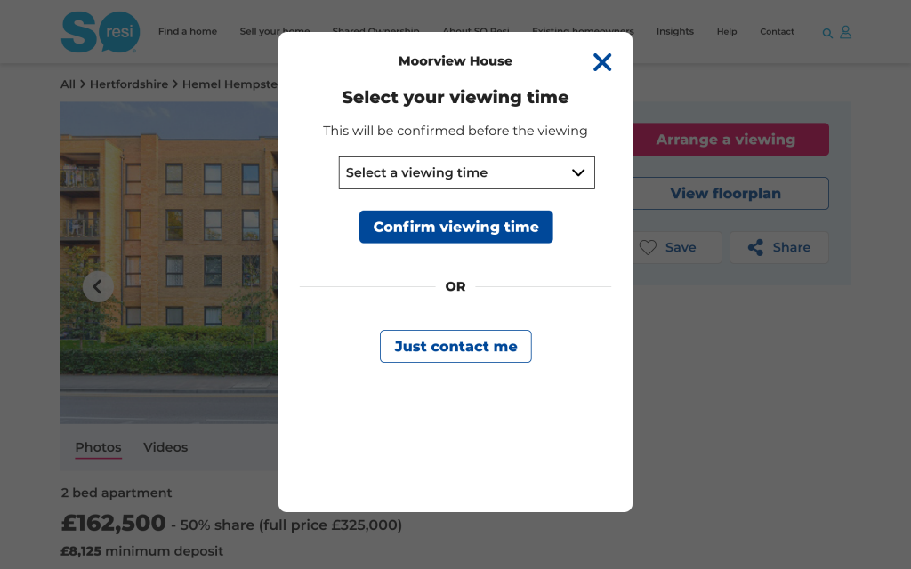
Arrange a Viewing
I designed functionality to enable customers to arrange a viewing of a specific property. If specific slots are not available, then an “Enquire now” option becomes available. Both options create leads in Salesforce. Later iterations allows customers to manage their viewing online.
This definite call to action boosted customer interaction by over 20%.
This was the first ever viewing booking system in the shared ownership market.
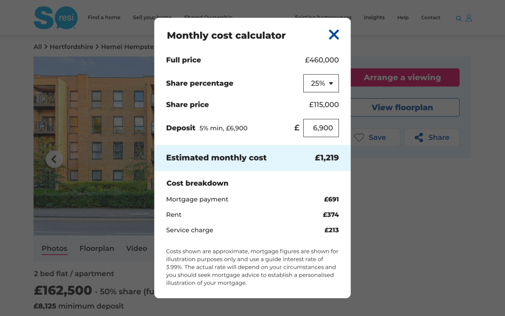
Affordability tools
I designed affordability content and tools – such as the Monthly cost calculator – to help buyers understand the costs of living in a shared ownership home on a monthly basis, and to search for homes according to their affordability.
Location landing pages
In order to help customers understand where we offer properties and to also catch organic search traffic, we created a suite of location landing pages, which showcased relevant properties whilst also linking in to the property search flow.
‘Explore’ content
Most customers know exactly where they want to live and dive straight into the property search flow. However, some have a more flexible, open outlook and want to see where properties are available. In the absence of maps (see Challenges below) we had to find a way of showcasing where our properties were. This was achieved through the ‘Explore’ module which included regional and a curated “Most popular” options.
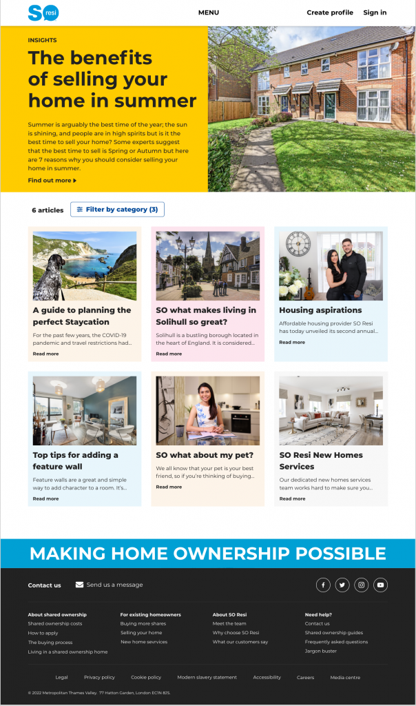
Blog pages
In order to catch organic search traffic (e.g. “Shared Ownership homes in Reading”) we created a suite of blog pages, which then funnelled traffic into the property search flow.
PHILOSOPHY
Overall, we tried to minimise friction and add real value to the customer at every opportunity.
Many websites try and coerce their users into creating an account as soon as possible, so they can then bombard them with emails. This barrier is annoying and makes for a poor user experience, putting-off users, who go elsewhere. In view of this, we made a conscious decision to make the website as friction free as possible and offer value where we could without forcing users to sign up. Users should want to create an account and see the value in it rather than simply being strong-armed into doing so.
As always, we took an MVP approach, then iterating to deliver value as quickly as possible. This allowed us to learn, and then improve with each iteration – rather than taking a long time to deliver something that might not in fact be wanted by customers.
CHALLENGES
- We knew from research that customers valued maps in their property search, but despite our protests, senior management vetoed their use due to costs. Really! This meant that we had to try and find creative alternatives to help customers in their property search.
- SO Resi is a very regional business with properties focused around London and Nottingham (due to the merger of 2 housing associations). Equally, numbers are modest, with often fewer than 100 property developments on the site at any one time. These factors made the search flow challenging, compared to, say, Zoopla who have thousands of properties nationwide.
- SO Resi is a low traffic site due to its (relatively) niche nature and so getting in statistically significant data on things like A/B tests was often very slow.
- As is common with lots of templated sites, the business users did not fill the templates out in the ‘right’ way, despite ongoing training. Neither did they communicate with the Digital Team if they needed new functionality. This was aggravated by staff turnover and (poor) internal training. Hence at times the templated pages became a mess. This demonstrates the need for ongoing content management and communication.
- Sales agents failed to keep diaries up to date, so Arrange a Viewing not available for many properties.
- Not enough developer resources available to implement all of our ideas
EXAMPLE SCREENS
Here is a selection of interfaces from this project:
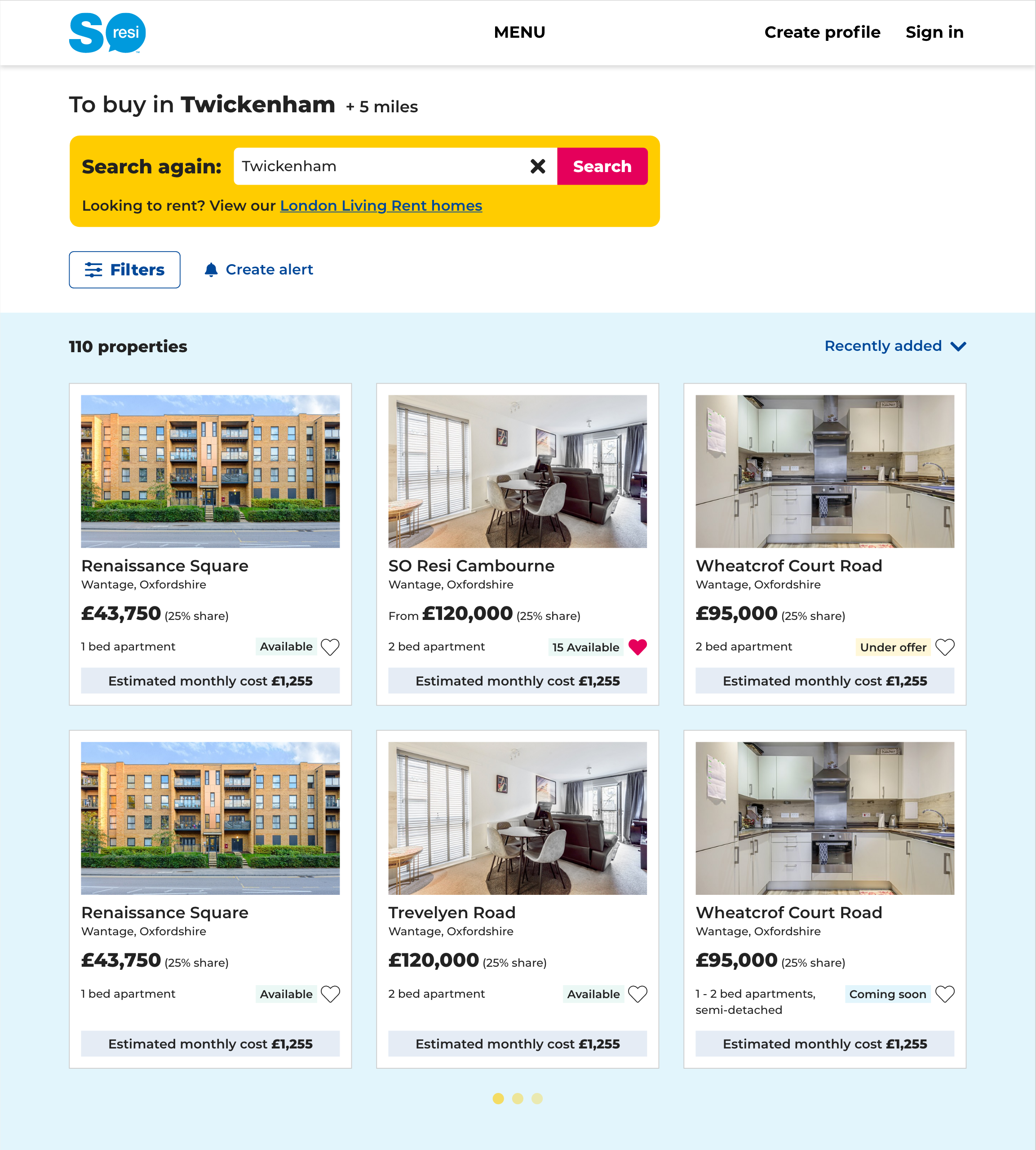
Property search
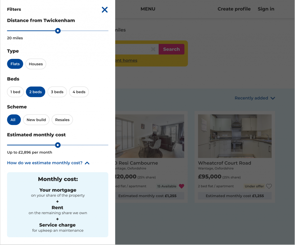
Search filters
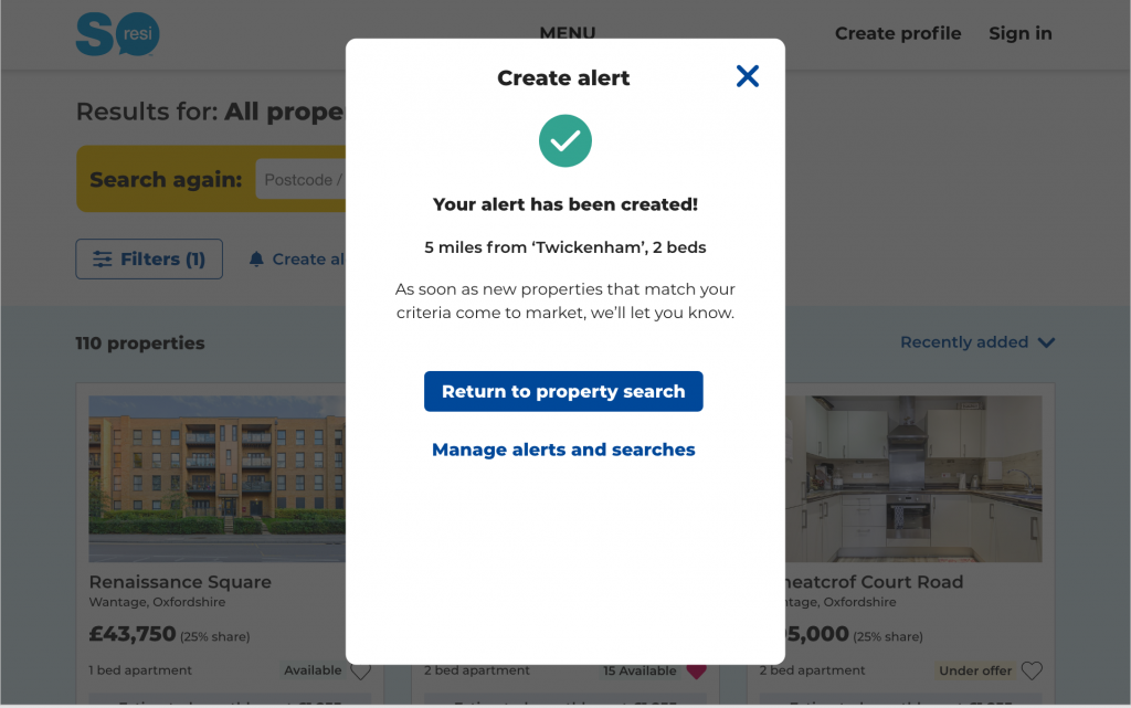
Create alert
Arrange a viewing
Monthly cost calculator
Save a property
Property development template
Location landing page
Blog landing page