As Senior UX/UI Designer, I oversaw the re-branding of the SO Resi website, transforming concepts produced by an external agency into workable, accessible designs which complied with best practices.
PROJECT DRIVERS
The overall SO Resi brand is managed by an external agency, who also design and produce all of the property brochures and other marketing collateral. This arrangement is not uncommon – it was also my experience at British Airways – and these external parties often bring a vision and expertise that internal staff may not have.
Unbeknownst to the Digital Team, this agency had been tasked by the Marketing Team to completely rebrand the SO Resi website. Thus we were invited to a meeting and presented with a set of ‘completed’, signed-off designs. As one might imagine, this came as something of a surprise!
PROCESS
Acting as UI Designer and in-house expert – I’d already spent several years working on the site as sole UX/UI Designer – my role was to translate these ‘signed-off’ designs into a set of workable specs for the development team to build, hopefully keeping all stakeholders happy with the finished product. These templates were then built, tested and delivered to the business.
This meant managing the whole process, liaising with all stakeholders including Senior Management within MTVH, Marketing, The Digital Team and agency staff including 2 designers and an account manager. Training the agency designers was necessary. As they were used to using Indesign and all previous design on the site had been done using Adobe XD, it was agreed that XD would be used across the project. This was disappointing, as The Digital Team would have actually liked to have used this opportunity to move to Figma, but this was out of scope; extensive training in new software was not part of the agreed project scope or budget.
The initial brief was to simply re-skin the existing site, which would include areas of the site we knew needed attention. I therefore negotiated that we improve areas of the site where possible rather than just engaging in ’turd polishing’.
Due to the sizeable volume of work, the new designs were to be delivered in a number of tranches
TASKS
- Bringing the supplied designs into the bootstrap framework – standardising widths, spacing, etc.
- Applying industry best-practices to the designs – for example, standardising text colour across the site, with one colour for static text and one for links.
- Establishing a style guide with font stack, colours, etc. across all breakpoints.
- Removing inconsistencies across the suite of page designs, focusing on developing a series of templated modules rather than individual, bespoke pages
- Producing mobile versions of all designs.
- Making improvements where appropriate, both in terms of changing supplied designs and addressing issues that we knew existed but didn’t have time to address beforehand.
- Ensuring all pages are accessible.
- Build of page templates
- QA testing of all deliverables.
- Release of new page styles in a staggered way as agreed with stakeholders.
- Design and delivery of pages – many in the My Account space – missed out by the aggency
CHALLENGES
- Unfortunately, this agency had virtually no experience or expertise in designing websites – no understanding of general website design principles, accessibility or the technical frameworks that were used – Bootstrap, in this instance. Neither did they have any understanding of responsive design. Indeed, despite mobile accounting for more than 85% of all traffic, designs were only created for desktop, based on a high res iMac screen. Finally, and perhaps more importantly, they had no understanding of the key user journeys and had not taken part in any research with customers or data analysis. Everything was based on idle conjecture…
- The designs presented had been created in InDesign and were more like magazine spreads than webpages. Every page was approached as a unique, bespoke entity, with nothing approaching standards. Yet the site was templated, based on a modular approach. There was clearly a large gap between the signed-off ‘vision’ and the responsive, accessible website that the Digital Team might be happy to build.
- I did not like some aspects of the design, including the use of stock imagery which I found to be corny. Stock imagery always looks like stock imagery, and customers see through it straight away. This was especially frustrating as I’d recently written a photography brief which advocated the use of real residents in real homes. I raised this with the stakeholders, but they were adamant they wanted to go with the direction set by the agency. In this instance I had to accept their decision and try and make it work.
- In reality, this was a very political situation. It’s perhaps galling when having worked on a website for several years, with great effect, that we are not involved at the early stages of such projects. Nonetheless, it was important that the Digital Team were seen by the wider business as enablers, making things happen rather than saying ‘No’ all the time. Personally, I didn’t care for much of the new designs, but that didn’t really matter. My role was to make these concepts work.
EXAMPLE SCREENS
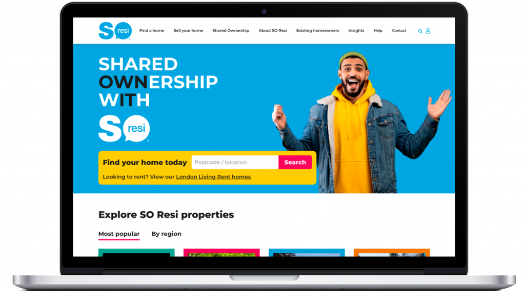
Supplied homepage design
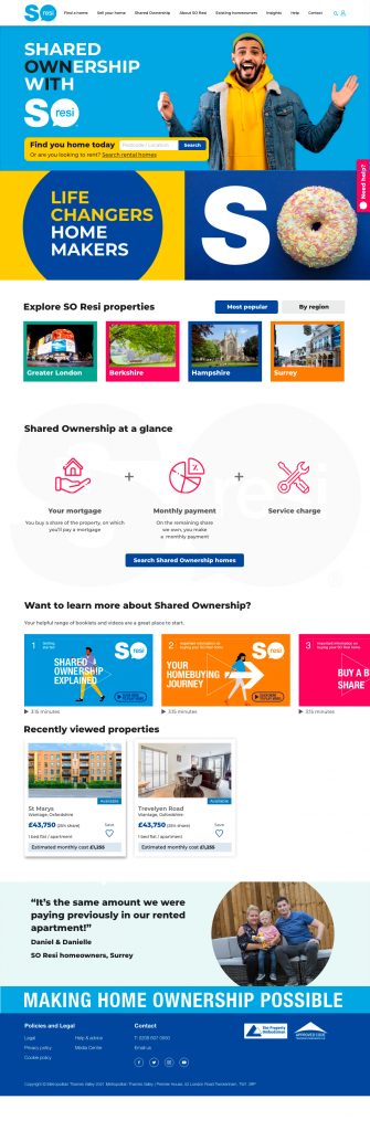
Reworked homepage design

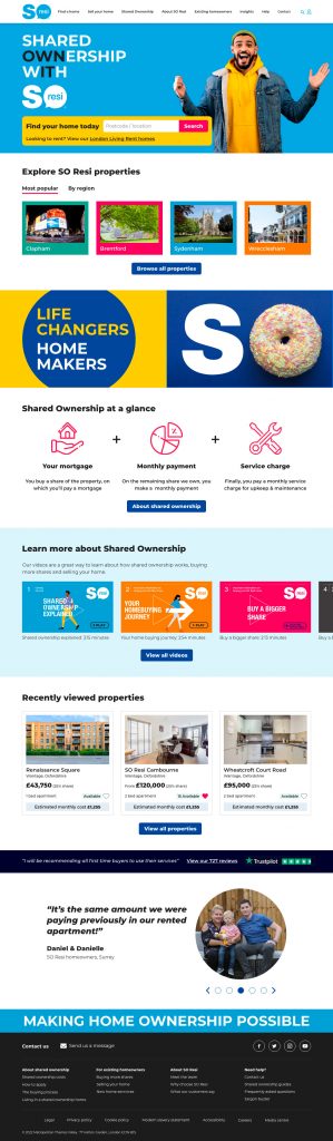
Mobile homepage design (none supplied)
Supplied About Shared Ownership page design
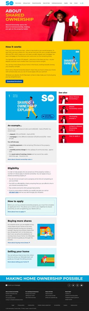
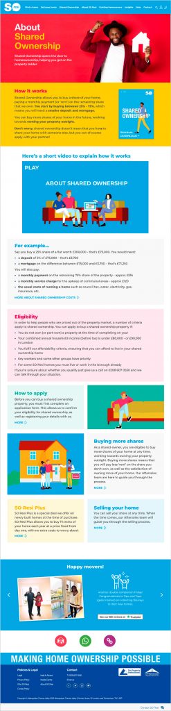
Reworked About Shared Ownership page design

Mobile About Shared Ownership page design (none supplied)
FINAL WORD
It would be very easy to take the attitude that the agency responsible for the initial designs were incompetent and berate them for it. I have seen this attitude many times in the past working in IT and it is something I find unacceptable. Whilst they did not have specific expertise in website design, they were clearly very talented in lots of other aspects of design and were, at the end of the day, doing something that they’d be asked to do, to the best of their ability. They were keen to learn and a real pleasure to work with. Under no circumstances do I wish to belittle their talents and contributions to the project.
What is frustrating however, is not being involved earlier. So much time and effort could have been saved had I been brought into the project at the outset. Hopefully the organisation have learned from this and will engage stakeholders and experts earlier in future.